Jul 27, 2012
There was a time -- between the flickery black-and-white films of yore and the hi-def color-corrected movies we watch today -- when color was in flux.
Filmmakers and designers didn't yet know how to use it. Studio executives didn't want to pay for it. Some critics even found it distracting. One wrote, in 1917, "That all forms of screen drama will ever best be shown in color is more than a doubtful question."
Complicating matters even further was the fact that there wasn't just one color palette, there were more than a dozen. Pathé Color, Prizma Color, Kinemacolor, Brewster Color, Gilmore Color, Douglass Color, Kelley Color, Cinecolorgraph, Kodachrome, Cinechrome. Each was a corporation, jockeying to win profitable Hollywood contracts. And each used an entirely different process -- different cameras, different film, different ways to develop that film, sometimes even different projection equipment.
All these differences also meant that each process had its own sweet spot on the color spectrum. For instance, Kodachrome produced nice flesh tones, and Brewster Color had "extraordinarily good reds." Each had its weaknesses, too. Kinemacolor blues were non-existent; eerily, if an actress had light blue eyes, her iris photographed nearly white. Sometimes a process even had its own unintended special effects: one method that depended on successive exposures of red- and green-sensitive film could mistakenly capture a horse with two tails...one red and one green. In 1919, early film journalist Terry Ramsaye worried about another effect:
By the tinting and toning process we can have a green pasture, in tone, with a blue sky above, in tint, but the cream and red jersey cow in the foreground will also be reduced to greens and blues. This effect may be very well for the spectator who knows a jersey cow when he sees one, but for Johnny Tenement Child it is all very bad, because he is likely to get the notion that cows come in green and blue.
If these were the only problems with color onscreen, filmmakers could have planned around them: use reds, but not blues; stay away from farm animals. Adapting to straightforward rules like these is how art directors designed for black-and-white films.
But with color, it was far trickier than just being clever during filming.
Even if a filmmaker put all the time and thought in the world into what to include in the frame, he (they were almost all male) could never be sure what would come out of the projector once the film was done. One inventor tinkering with Eastman film in 1920 noted "Cobalt blue photographs like a black; a brighter magenta pink would reproduce as orange; and a very pale lemon yellow would become almost white." White lemons, orange flamingos, green cows. Nobody could trust their eyes any more.
This was the wild west of color.
Into this vacuum of expertise stepped one woman, a 5'4" former catalog model. According to The New York Times, she had "honey-colored hair and a honey-and-waffle Dixieland patois." She wore an ugly hat. Her name was Natalie Mabelle Kalmus.
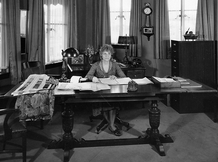
Natalie Kalmus, photo permission of American Stock Photography
Kalmus worked for a company you may have heard of: Technicolor.
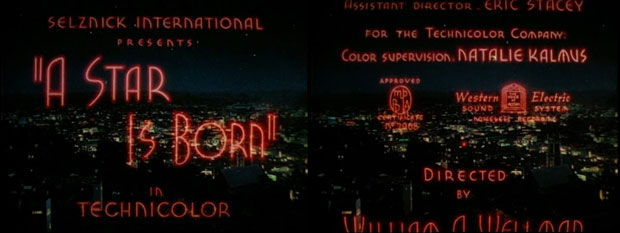
A Star is Born title screens. Courtesy of the Movie Title Stills Collection.
Actually, she did a lot more than just work there. She was married to one of the three inventors of the Technicolor process, the one who went on to become President of the company. (Kalmus's husband -- Herbert Kalmus -- was also the one who came up with the name Technicolor, an homage to the "T" in his alma mater, MIT.) While her husband experimented in the company's first laboratory -- a tricked-out railway car, complete with darkrooms and offices -- Natalie Kalmus was the first test subject. No exaggeration, then, to say that the Technicolor process was calibrated to her: the hazel of her eyes, the red of her lips and, of course, the golden brown of her hair. The media later dubbed her "the world's first Technicolor star."
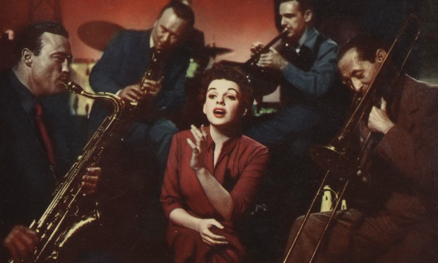
Still from "A Star is Born" (1954), Film Society of Lincoln Center
But Natalie contributed more to the company than just her good looks. You see, she was part of the package deal.
Technicolor had a brilliant business strategy -- it was one of the reasons they eventually came out on top. Instead of selling individual cameras to studios, they rented them out at a flat rate. But they didn't just rent out the camera, they also provided cameramen, equipment, processing facilities, and -- most crucial of all in the era of blue-green cows -- full-time on-set technical support. A crack team of Technicolor "trouble-shooters" known as the Color Advisory Department. At its head was none other than Natalie Kalmus. She described the job as "playing ringmaster to the rainbow."

Technicolor Motion Picture Corp., October 27, 1948. Los Angeles Public Library Photo Collection.
It's easy to dismiss Kalmus as a nepotism hire who only landed the job because she was married to the boss. (In fact, they weren't even married; they secretly divorced in 1921, but kept living and working together. An odd arrangement today, even odder at the time.) But Natalie Kalmus was qualified for the job. For starters, she knew her way around the color wheel like few others. She had studied painting and drawing at art schools across Europe and North America -- in Switzerland, in Florida, in Massachusetts, in Ontario. She was well-versed in the artistic canon, referencing in her writings "the light effects of Rembrandt, the atmosphere and arrangements of Goya, the brilliant sunlight of Sorolla, the mysterious shadows of Innes." She knew a good deal about the technical side of color filmmaking, too. She worked variously as a film developer, cutter and camerawoman. She had an encyclopedic knowledge of fabrics. According to a profile in The Southeast Missourian:
Mrs. Kalmus' office is a veritable card-index file of material. Thousands of samples of dress materials of innumerable shades are catalogued in her files. She can put her finger on any one of them and tell how it will reproduce on the screen. She can also tell at a glance what combinations of colors and materials will create certain effects. And she is never wrong.
But being qualified for your job and being good at it are two very different things …
Natalie and the Color Advisory Department worked as follows. When Technicolor decided it'd take on a film, the studio would send over a working script. Natalie and her team would "analyze each scene, each set, and each character to ascertain what dominant emotion is to be expressed, and what colors are needed ..." From there, the department would create a "color chart for the entire production," the color equivalent to the sheet music for an underscore.
Natalie had her own specific rules for the color charts, which she outlined in her artistic manifesto, titled "Color Consciousness." One rule was that neutral colors should be used more often than bright ones. ("A super-abundance of color is unnatural and has a most unpleasant effect not only upon the eye itself but upon the mind as well.") Another was that bright colors should only be used to highlight narratively important information. (This rule became known as the "law of emphasis.") A third of Kalmus's color commandments was that clashing colors should never ever be in the same scene together, lest they accidentally end up next to one another.
Natalie's color charts weren't suggestions. They were directives. If a set of drapes violated her rules, they were out. No questions asked.
Although the Color Advisory Department was meant to help, the filmmakers found themselves getting more "help" than they needed. Or wanted. They felt that Natalie Kalmus muscled her way from being technical support to wholly deciding a filmmaker's palette and totally supplanting the director's artistic vision. To them she was a color censor.
Vincente Minnelli ("An American in Paris") claimed that he "couldn't do anything right in Mrs. Kalmus's eyes."
In response to Kalmus's rule about clashing colors like red and orange, Cecil DeMille ("The Ten Commandments") fumed "Well it's too bad the good Lord up in heaven didn't have a Technicolor consultant when he made apples and oranges!"
Screenwriter Arthur Laurents ("Rope") wrote in his memoir, "Alfred Hitchcock did not control color, Natalie Kalmus, High Priestess of Technicolor, controlled color." and "Natalie Kalmus might have to be killed off-camera."
Allan Dwan ("Slightly Scarlet") said bluntly, "Natalie Kalmus is a bitch."
But whine as they did, these filmmakers were stuck with her as part of their package deal with Technicolor. And for all their auteur machismo, none of them could stand up to this 5'4" woman.
That is, until 1939 … "Gone With The Wind."
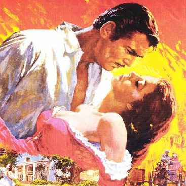
"Gone With The Wind" was a watershed film in the history of color cinema, and even before it premiered, everybody knew it. In its time, it was the longest movie ever made, and one of the most expensive. Technicolor sure knew how important the film was; for the Atlanta fire scene -- one of the earliest scenes filmed -- all seven Technicolor cameras in existence were on set filming. Behind the cameras, the movie's production history was famously nightmarish; it cycled through five directors (one of whom had a mental breakdown), had about fifteen screenwriters on staff (churning out rewrite after rewrite), and -- despite the 3.9 million dollars allotted to it -- constant budget problems.
The film adaptation was helmed by megalomaniacal producer David O. Selznick. (The "O" was decorative.) Life called Selznick "the most dictatorial and irregular executive in an industry where irregularity is commonplace." With Selznick, Kalmus met her match. She believed in demure naturalistic colors. He believed in expressive saturated colors. He wanted the brightness of the film to reflect Scarlet O'Hara's changing fortune. She didn't.
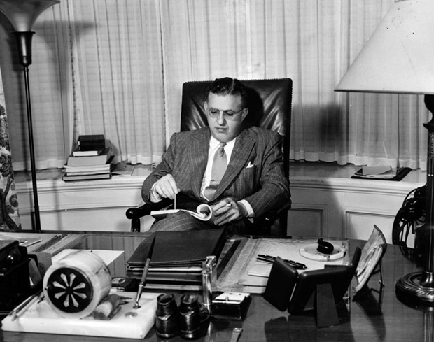
David O. Selznick, 1947. Los Angeles Public Library Photo Collection.
The two went head-to-head over sets, props, and wardrobe. When Natalie didn't like the way a certain character was costumed or a certain set was furnished, she'd just change it without asking Selznick's permission. According to Technicolor historian Fred E. Basten, "On one occasion, an entire set had to be replaced."
For much of production, Selznick -- hopped up on Benzedrene -- dictated memos at a feverish pace: "I cannot conceive how we could have been talked into throwing away opportunities for magnificent color values [based on] … the squawks and prophecies of doom from the Technicolor experts." Selznick coined the term "production designer" for his art director William Menzies to help stack the deck against Kalmus. Natalie wasn't deterred.
The conflict climaxed over mulberry wallpaper. As Basten told the story:
The wallpaper had been selected for the dining room at Twelve Oaks and was to be seen briefly as a background for beige jackets worn by several male cast members. "Out with the wallpaper!" ordered Natalie. Her reasoning: the beige would fade into the mulberry, therefore, the actors would be lost in the scene. Color tests were taken by … William Menzies, which showed the hoped-for contrast between the two colors. Natalie was proven wrong, but she wouldn't give in and the mulberry paper was removed. So was Natalie.
Selznick brokered a deal with Natalie's ex-husband and boss Herbert to keep her off set. She soon departed to head Technicolor's plant in Great Britain.
Gone With the Wind, of course, went on to win 10 Academy Awards including Best Picture, Best Color Cinematography, and even an Honorary Award for Menzies citing "outstanding achievement in the use of color for the enhancement of dramatic mood."
No awards for Natalie.
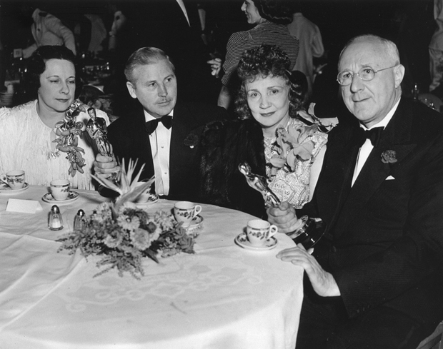
Lillian Rennahan, Ray Rennahan, Natalie Kalmus, Dr. Herbert Kalmus at the Cocoanut Grove, 1940. Courtesy of Ambassador Archive.
She went on as part of Technicolor's Color Advisory Service for the next ten years, often farming out her assignments to underlings. By the late 1940s, however, her life fell apart. When her ex-husband tried to remarry, she denied they had ever officially divorced, probably in an attempt to keep a share of the $3.5 million business. The divorce trial of the "King and Queen of Color" got messy. Headlines included "NOT MY WIFE" KALMUS SAYS IN ALIMONY CONTEST and COURT SETBACK FOR MRS. KALMUS BRINGS HYSTERIA. Shortly after that, she lost her job, prompting another headline: WOMAN MUST PAWN JEWELRY TO EXIST. As the ultimate irony, she later turned to advertising black and white televisions.
The late 40s were not great for Technicolor, either. Crucial patents it held expired in 1945, and a government antitrust suit in 1947 busted up its effective monopoly on color film. By the early 1950s, Technicolor's former research partner, EastmanColor, dethroned it. Technicolor's signature three-strip process was tossed aside in favor of EastmanColor's cheaper and technologically simpler method using a single layered film strip. (One key reason for EastmanColor's triumph was that it could handle widescreen processes like CinemaScope far more efficiently than Technicolor.) After 1953, Technicolor operated primarily as a laboratory and research firm. The package deal was over. But, in large part thanks to Technicolor, the future of color movies was secure.
The next time Natalie Kalmus made the papers, it was in her eighties, in a hospital near Boston. A 1964 Variety article described her birthday as a sad affair "with no one on hand to share her birthday cake except the corps of sympathetic nurses who presented it to her." Kalmus reportedly "wept tears of gratitude" when the cake was wheeled in. "There were no cards, no messages, no calls from her many friends and onetime associates in the film business." She died a year later.
Her end was lamentable, and that's the way most people remember her story. She was a color fascist and then she died. Good riddance.
But there's another way to look at it.
In the 1920s, before the Color Advisory Department even existed, filmmakers were experimenting with new color technologies. The technologies were imperfect, but studios released the results in cinemas anyway. Hues were gaudy and bled into each other until the films "looked like Spanish omelets drenched with ketchup." By the time the Great Depression came, broke studios didn't want to foot the soaring costs just to make mediocre pictures. Color companies like Technicolor took a big hit.
That's when Natalie Kalmus came on the scene. She wasn't only meant to be technical support. She was also meant to be quality control for the industry. Someone to keep an eye on every color film released to make sure it wasn't garish and tacky. She was bad at her job because she couldn't really deal with people, but what she was trying to do was noble. To make sure filmmakers weren't just using colors willy-nilly to thrill and titillate, but instead were telling a real story in a professional way. To make sure that precarious color wasn't just a transient novelty, but rather the future of all cinema.
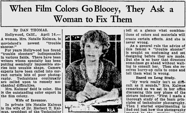
Not only did she pull it off, but she did so as a petite and uncredentialed woman in male-dominated Hollywood. She got a lot of flack - people said she was color blind, they made fun of her makeup and her ugly hats, they called her a "bitch." Nobody expected her to be as strong and powerful as she became. It even made headlines: WOMAN SUPERVISES COLOR; EXPERT IN COLOR PHOTOGRAPHY, WOMAN IS PAID $65,000 A YEAR, and best of all:
Screenshot of The Southeast Missourian, 04/16/30
In that sense, she was a bit of a hero.
Today, one of the most widely recognized pioneers in movie visual effects is Jonathan Erland. He worked on the first Star Wars movie in 1977. This year, the Academy of Motion Pictures gave him a Medal of Commendation. He never met Natalie Kalmus, but he does know her story well. He told me how "particularly unpopular" she was because of her "opinionated and strident" advice. But he also saw her as an artist with a clear aesthetic sense of what Technicolor could offer.
"[With Technicolor dye-transfer process,] you have the kind of control that an artist painting in oils might have, but you had this level of control over a photograph and it is truly wonderful … And so people like Natalie were offended by the choices that the film producer was making when he had this infinite control and could do much more subtle things and he was ignoring that and just going for the splashiest noisiest thing he could think of. She knew what the process was capable of. And her design sense lobbied for something other than what she was usually being asked for."
"You could make the case," Erland said, "that she was probably giving perfectly excellent advice on color generally."
In the end, however broke and alone she was when she died, her name achieved a kind of immortality. As was spelled out in the contracts for the Technicolor package deal, Natalie Kalmus's name appeared in the opening credits to all 350+ Technicolor movies released between 1930 and 1950, including "The Wizard of Oz," "The Adventures of Robin Hood," and yep, even "Gone With The Wind."
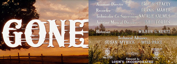
Gone with the Wind title screens. Courtesy of the Movie Title Stills Collection.
First and foremost, this post would have been impossible without the help of visual effects whiz Jonathan Erland (and his associate Kay) or the encyclopedic film scholar Scott Higgins, whose book Harnessing The Technicolor Rainbow may just change the way you watch color movies. Visit Scott Higgins's blog to see and read more.
Also supremely helpful: Maryrose McMahon at the Science and Technology Council of the Academy of Motion Picture Arts and Sciences; the staff of the Special Collections of the Margaret Herrick Library; Ryan Lintelman and his colleagues at the American History Museum; Steven Hilger at the Ambassador Archive; and Christina Rice and her team at the Los Angeles Public Library's Photo Collection.
The title cards were courtesy of Christian Annyas, who is behind the gorgeous online Movie Title Stills Collection. Thanks to bloggers Nick Zegarac and Danny Miller, as well as to Jeffrey Brown, Carly Mensch, Steven Press, and Gillian Jacobs for feedback on an early draft.
